Is design thinking part of your marketing strategy?
Brilliantly designed marketing material – whether it’s a brochure, website, pitchbook or anything else – doesn’t just happen. Developing stunning visuals that truly differentiate brands requires design thinking,1 or a strong methodology for developing creative ideas.
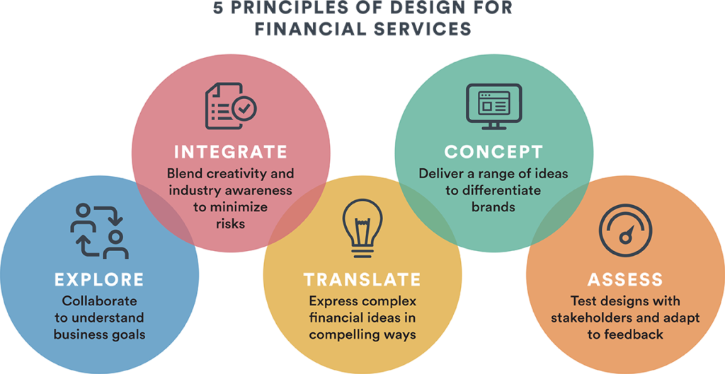
Applying a systematic approach to design is especially important when marketing financial products or services, given how dynamic and complex the industry can be. Here are some ways Ext. Marketing integrates design thinking into our creative process:
Collaborate to unearth business goals
The roots of all strong creative solutions stem from a thorough review of the goals a business would like to achieve through design. The review process involves all creative professionals instrumental to a project, including writers, editors, designers, and digital and analytical experts. This integrated, all-hands-on-deck approach to exploring key stakeholders’ needs can help address a wide range of factors that may shape or inspire design.
Blend creativity and industry awareness
Conceptualizing financial services requires a multidimensional lens. Along with creative expertise, this process needs to integrate deep industry knowledge. For instance, financial services organizations must remain aware of compliance/regulatory standards or uphold certain levels of transparency throughout the marketing process. If these requirements aren’t met, there is a risk of conveying a wrong or inappropriate message. Consulting creative professionals experienced in financial services can help manage these priorities and minimize the risks unique to this highly regulated industry.
Translate complexity in compelling ways
Financial organizations are often challenged by how to communicate technical information to clients. It takes wide-ranging perspectives from creative and analytical experts to come up with differentiated design solutions that use data visualization and other devices to illustrate the concepts in new, compelling ways without sacrificing meaning. One example of this could include creating a concise, engaging infographic that clearly captures the benefits of a complex product or illustrates the steps required for an intricate investment process.
Deliver a range of differentiating concepts
Concepting is a vital step in our design process. We try to avoid getting stuck on one or a few design samples. It’s wise to build a range of preliminary concepts and iterate to see what will resonate best with a given audience.
Traditionally, the financials sector has been relatively conservative when it comes to design (often using more subdued colours, graphics, branding). But that is changing. Our clients are no longer limited by these options. In an increasingly competitive environment, differentiating brands is crucial, and visuals are an important way to achieve that goal.
It’s okay to test the boundaries at this phase of your design thinking. Try providing various representations, perhaps through bolder, more unconventional approaches, to challenge your stakeholders and highlight your brands in different ways.
Test, learn and adapt design
The creative process is never static and should remain highly iterative until the best possible outcome is achieved. Once initial drafts of your design are built, you need to test them with stakeholders and adapt to feedback, sometimes across multiple rounds. The status quo, especially in financial services, is always shifting, and you might need to modify your design in real-time. There are several feedback mechanisms you can try, including A/B testing, social polls or surveys to see if you are moving in the right direction.
Ext. Marketing is on top of the trends shaping the financial services industry, and we pride ourselves on helping our clients succeed. As an integrated marketing agency, we are known for creative content, design expertise and strategic digital distribution. Our creative team loves to bring left- and right-brain ideas together to give our clients a creative edge.
Are you looking to market your message through innovative design? Ext. Marketing takes design thinking to a whole new level and can help elevate your brand.
Interested in learning more? Contact us today at 1.844.243.1830 or info@ext-marketing.com.
1Nielsen Norman Group, Design Thinking 101, 2016
Make your website’s hero banner a conversion superhero
Your website’s hero banner is the area between the navigation and the start of your content. It does a lot of heavy lifting by setting the tone for your site, encouraging visitors to engage with your brand and helping to establish trust. The hero banner’s effectiveness could mean the difference between high bounce rates and high conversion rates.
If your hero banner is doing its job, you’ll be well on your way to conversion – whether that’s getting a prospective client to reach out to your sales team or sending them to discover your product and service pages.
Remember, website visitors tend to form judgements quickly: it takes approximately 50 milliseconds for users to cement an opinion about your brand.1
It’s no wonder that marketers are always looking to optimize their hero banners and above-the-fold content.
Here are some tips to help give your hero banner super strength:
1. Streamline
Keep your hero banner’s message simple. You want to inspire your visitors, not overwhelm them. Squeezing too many messages into the hero will inevitably dilute its superpowers. It’s been proven that less cluttered homepages are more likely to convert.2
2. Tell a story
The story in your hero banner needs to be told in your brand voice – reinforced by strong visuals and copy. Your website is your storefront, and you’ll want to “greet” users with an on-brand experience that showcases how you solve your clients’ problems and your unique selling proposition (or “USP”).
3. Use video and motion graphics
Video converts. About 84% of people have been convinced to buy a product or service by watching a brand’s video.2 It’s no wonder that video and motion graphics are popular choices for hero images. There are caveats: loop your content and keep it crisp, so you don’t bog down your website’s load speed. The ideal length is one or two seconds – content that is over five seconds in length is going to need optimizing.
4. Include calls to action
A call to action is usually placed in your hero banner for good reason – it’s a great way to lead visitors down the funnel. Try to be creative but concise with your calls to action. Remember, there’s more to life than “Learn more.” Use powerful imperative verbs that create a sense of urgency. “Watch,” “discover,” “read,” “subscribe,” “schedule.” Choose specific verbs that tee up a promise and give strong, direct instructions on what to do next.
5. Make it responsive
With mobile often being a user’s first interaction with your brand these days, it’s important to make sure your website is responsive (meaning it will “respond” to the screen size it’s appearing in). For hero banner content, you’ll want to ensure you engage visitors immediately and keep your objectives limited to a single goal or desired action.
To carousel or not to carousel?
There is much debate about whether you should use a carousel in the hero banner position. While many prefer the simplicity of a single message, others need to balance multiple messages. If you decide to adopt a carousel, put the visitor in the driver’s seat: avoid the auto-play feature as it may not give users time to digest the content before it advances. You will also want to make sure your carousel is optimized for mobile, including facilitating optional behaviours such as pinching, tapping and swiping to ensure a mobile user’s journey is seamless.
A/B testing can help
If you are deciding between multiple messages and creative executions, A/B testing can help shed light on what resonates best with real users. You can use this strategy to make sure your hero banner content is a true hero: saving the day and delivering new leads.
Is your conversion rate not where it should be? Ext. and our team of digital, content and UX experts can help optimize your hero banner and all your web content. Contact us today at 1.844.243.1830 or info@ext-marketing.com.
1https://www.academia.edu/534960/Attention_web_designers_You_have_50_milliseconds_to_make_a_good_first_impression
2135 Video Marketing Stats You Can’t Ignore in 2022
An introduction to accessible design
Not everyone is talking about accessible design. But they should be. This article provides an introduction to accessible design concepts and links to more information.
The following are just a few of many ideas that will get you thinking about taking on a broader, more thorough accessibility review.
Making print accessible
Accessible design for print is about clear messages – making sure that your readers understand what you’re saying.
Colour
People’s perception of colour can be affected by specific visual ailments, the environment or injury. While colour blindness impacts a certain portion of the population, the contrast between colour hues affects everyone.
It may now be a little passé, but do you remember the blue dress meme? If you haven’t seen it yet, it’s time to review issues such as contrast and colour.
Font
“Big letters” are important but it goes much further than that. In the corporate world today, the majority of accessibility discussions around fonts focus on kerning (the space between letters) and leading (the space between lines), as these have a dramatic impact on print legibility. So, avoid complicated fonts. Choose fonts with recognizable letters and don’t overcrowd your copy,.
Hierarchy
This is a slightly more abstract idea than colour and font. Hierarchy is about the organization and prioritization of content in the overall structure of your document.
When attempting to improve hierarchy, designers often increase header size, add subheads and create bullets (where possible). Hierarchy is incredibly important in web design as well, which we’ll get to next.
Making web design accessible
While the three concepts above also apply to the web, accessible web design is about clear navigation – making sure your visitors can find the information they need. Here are two ideas that are a little more specific to the web.
Logic
Content must be intuitive. Your visitors should be able to predict specific elements, such as navigation, on each page.
Operability
People must be able to access and navigate through content no matter what tools they use to do so, from a mouse to a keyboard, as well as voice recognition.
A note on AODA
When it comes to web design, accessibility goes beyond look and feel. You need to develop your website according to accessibility principles.
Although the Accessibility for Ontarians with Disabilities Act (“AODA”) currently applies to companies with 50 or more employees, we think investment firms of all sizes should think seriously about incorporating AODA principles into their next redesign.
Examples of AODA best practices include:
- Do not add content through Cascading Style Sheet (“CSS”) because it may be inaccessible to screen readers
- Tag PDFs so that they’re accessible to screen readers
- Add ALT attributes to IMG elements in your HTML
Links for more info on accessible design
There’s a lot more to say about accessible design. Check out these sources for all the info you need:
- For more details tips and insights, read RGD Ontario’s Access-ability
- Accessibility for Ontarians with Disabilities Act
- For web development issues, visit W3C
- Global Accessibility Awareness Day
Contact us at 416.925.1700, 844.243.1830 or info@ext-marketing.com to start making your print and web design more accessible.
Read more:
https://ext-marketing.com/commentaries-articles/5-reasons-investment-commentaries-arent-bad/